
Explore the design and symbolism of the Danelec brandmark and logo, reflecting our longstanding commitment to maritime innovation — serving as a vital aspect of our brand identity.
Understanding these guidelines is essential to building an unforgettable Danelec brand experience.
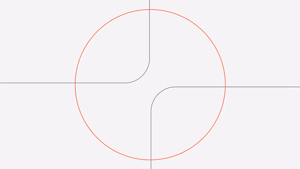
A powerful symbol with a strong connection to Danelec as a name — conveying a sense of forward momentum and the concept of creating connections.
Derived from the initial 'D' of Danelec, our symbol embodies the concept of forging connections and advancing progress. These elements are central to Danelec’s identity as an innovator within the maritime industry, reflecting our commitment to driving forward-thinking solutions in the sector.


Our wordmark, set in the Aeonik font, exemplifies clarity and modernity, mirroring Danelec's commitment to precision and forward-thinking.

For visual versatility, the Danelec brandmark, logotype and lockup can appear in any of our primary brand colors.


Guidelines
1.0 Black and White
While black is not a standard brand color, certain scenarios, such as laser printing, may necessitate these classic contrasts to ensure optimal visibility
2.0 Negatives
The most commonly used options are 2.1 and 2.2, with option 2.3 reserved for contexts requiring a more subtle or exclusive appearance.
3.0 Positives
Similar to the negatives, the first two options, 3.1 and 3.2, are recommended for general use, while the last option, 3.3, is ideal when the brand is already familiar to the audience.
By using the same typeface and settings as the core logo, we can effectively create new logos for our product branches.


Guidelines
Typesetting
To create a product brand, use the medium font weight. Set the tracking to -4% for positive colors values and -3% for negative colors.
Contrast
Always aim to set the Danelec text in one color and the brand text (e.g. "edge") in another color to clearly indicate that it is a sub-brand, not the core brand.
